Burning House
An interactive climate visualization that heats up my apartment according to temperature change predictions.
Grant
Funding has been made possible by The Puffin Foundation
Timeline
2024 - 2025
Tech
C++, Electronics, Fabrication
Concept
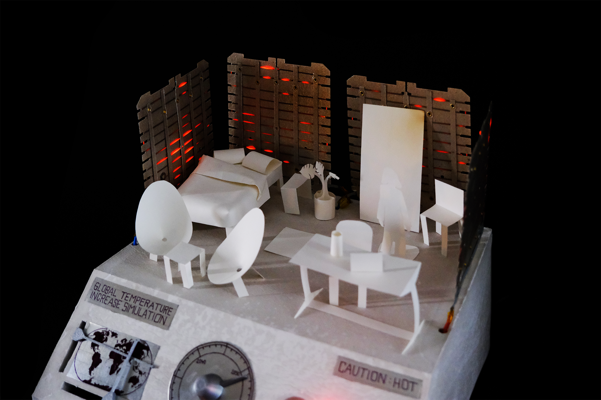
Burning House visualizes temperature changes around the world caused by climate change. A miniature version of my apartment heats up according to temperature prediction data. Users can interactively explore the dataset by selecting a custom location and a year in the future on the projects' interface.
Impact
Burning House is my second project in my climate change visualization series that aims to make complex climate data more tangible.
Heat especially is a variable that cannot be captured easily through traditional 2D data visualizations. Therefore I chose to visualize temperature change data by heating up (and burning down) an actual apartment using heating elements from a recycled toaster.
Heat especially is a variable that cannot be captured easily through traditional 2D data visualizations. Therefore I chose to visualize temperature change data by heating up (and burning down) an actual apartment using heating elements from a recycled toaster.
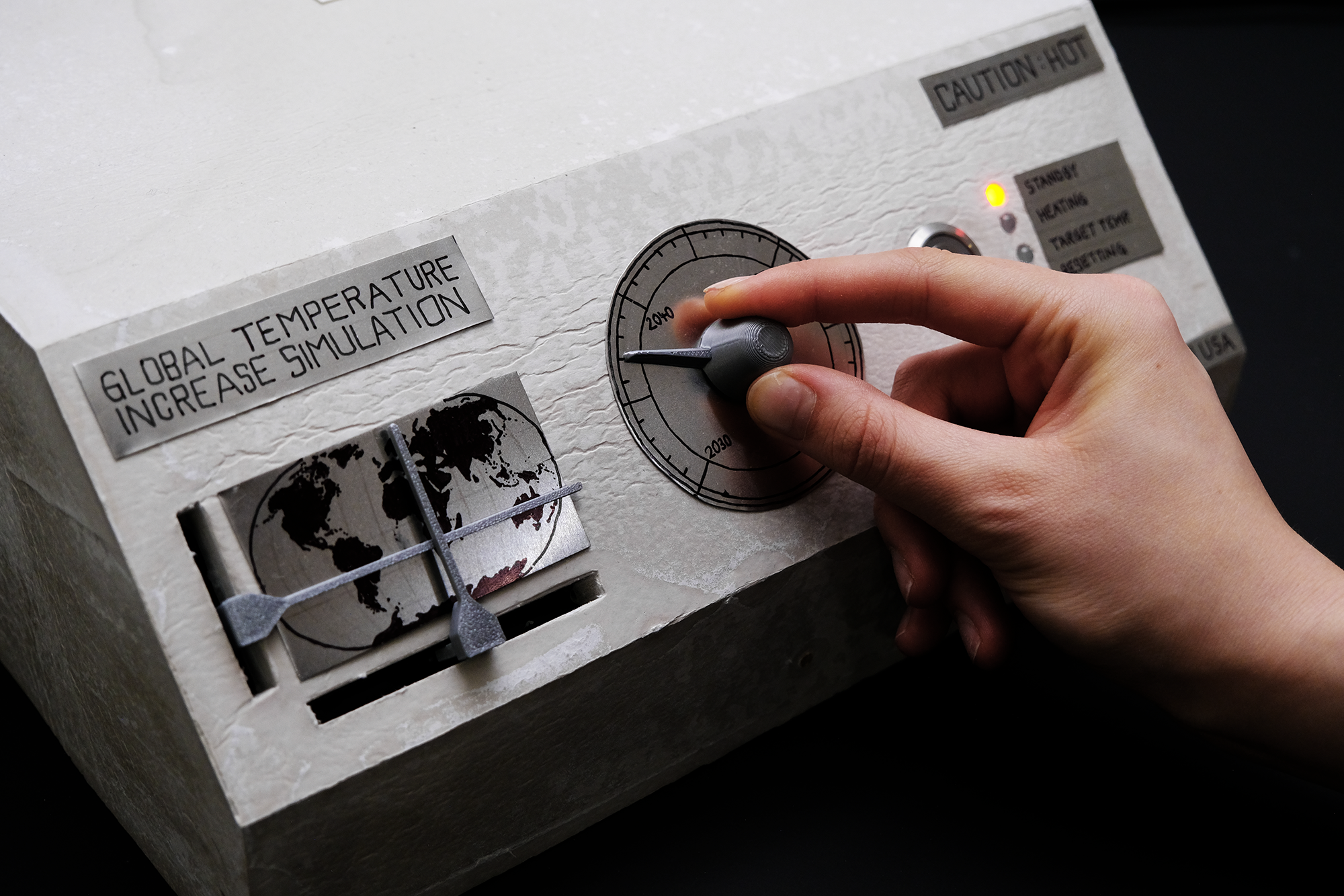
The Data Interface
Every person can customize the data they want to visualize by selecting their own (1) longitude and latitude on a world-map, and (2) by selecting a specific year in the future.
By allowing people to experiment with different scenarios through the interface, I hope to visualize that the effects of climate change vary hugely across the planet: Some vulnerable ecosystems suffer harsh temperature increases, while the handful of countries that contribute most to climate change go mostly unscathed.
By allowing people to experiment with different scenarios through the interface, I hope to visualize that the effects of climate change vary hugely across the planet: Some vulnerable ecosystems suffer harsh temperature increases, while the handful of countries that contribute most to climate change go mostly unscathed.
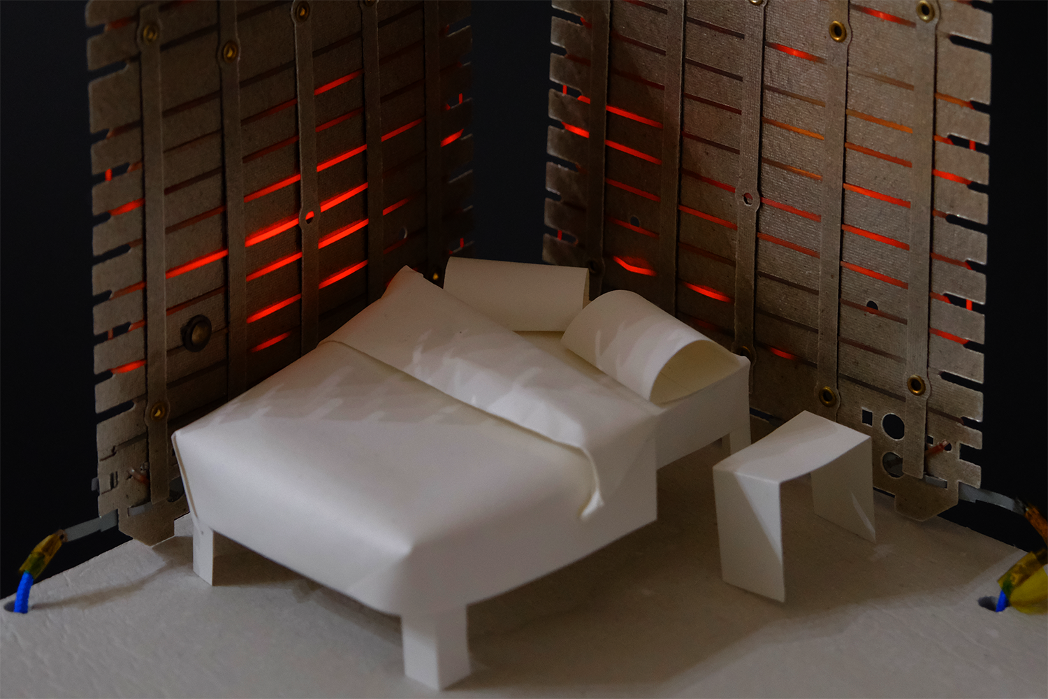
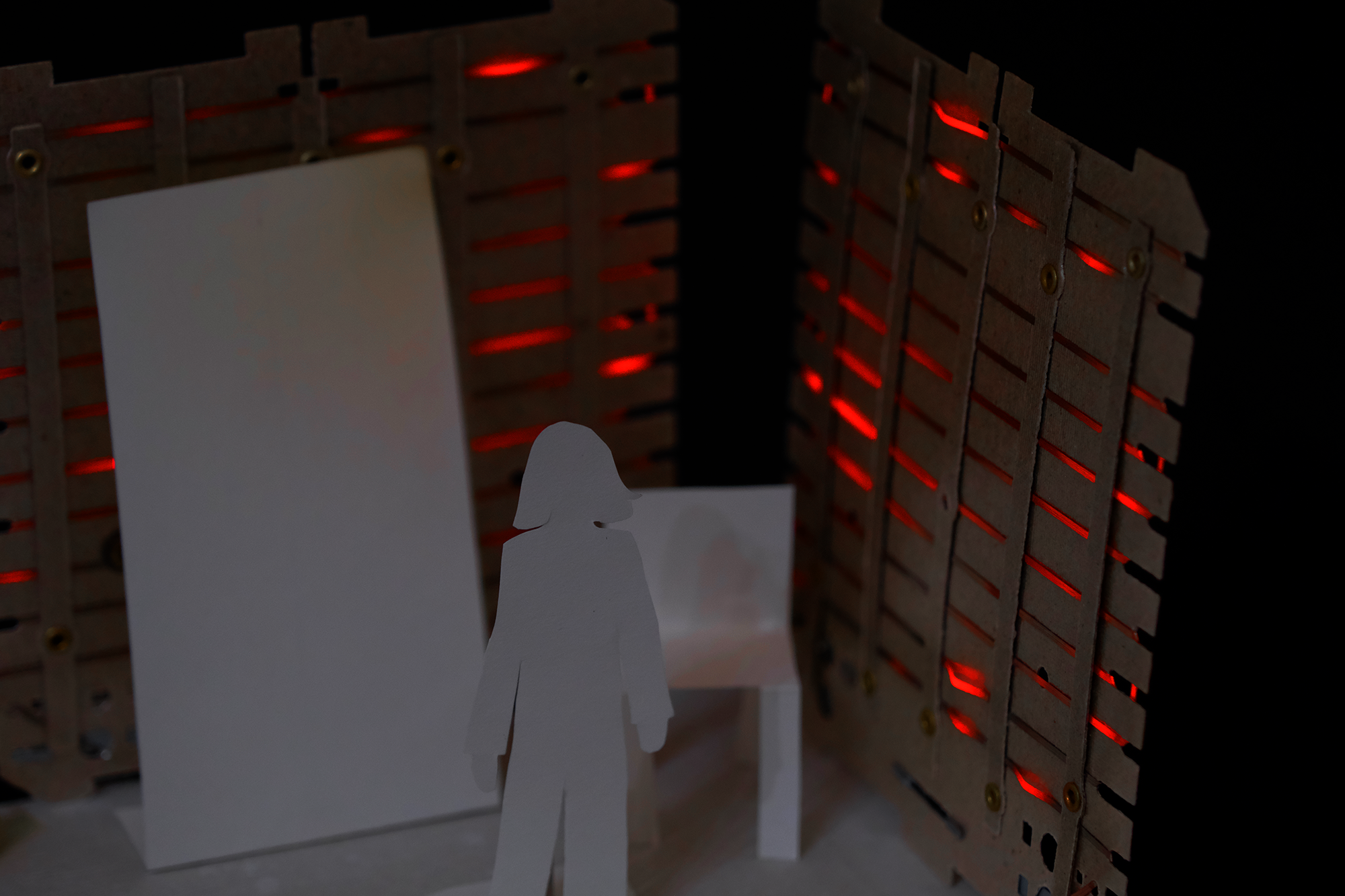
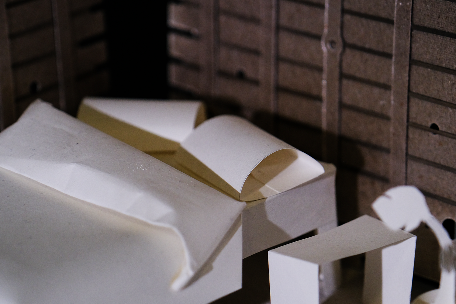
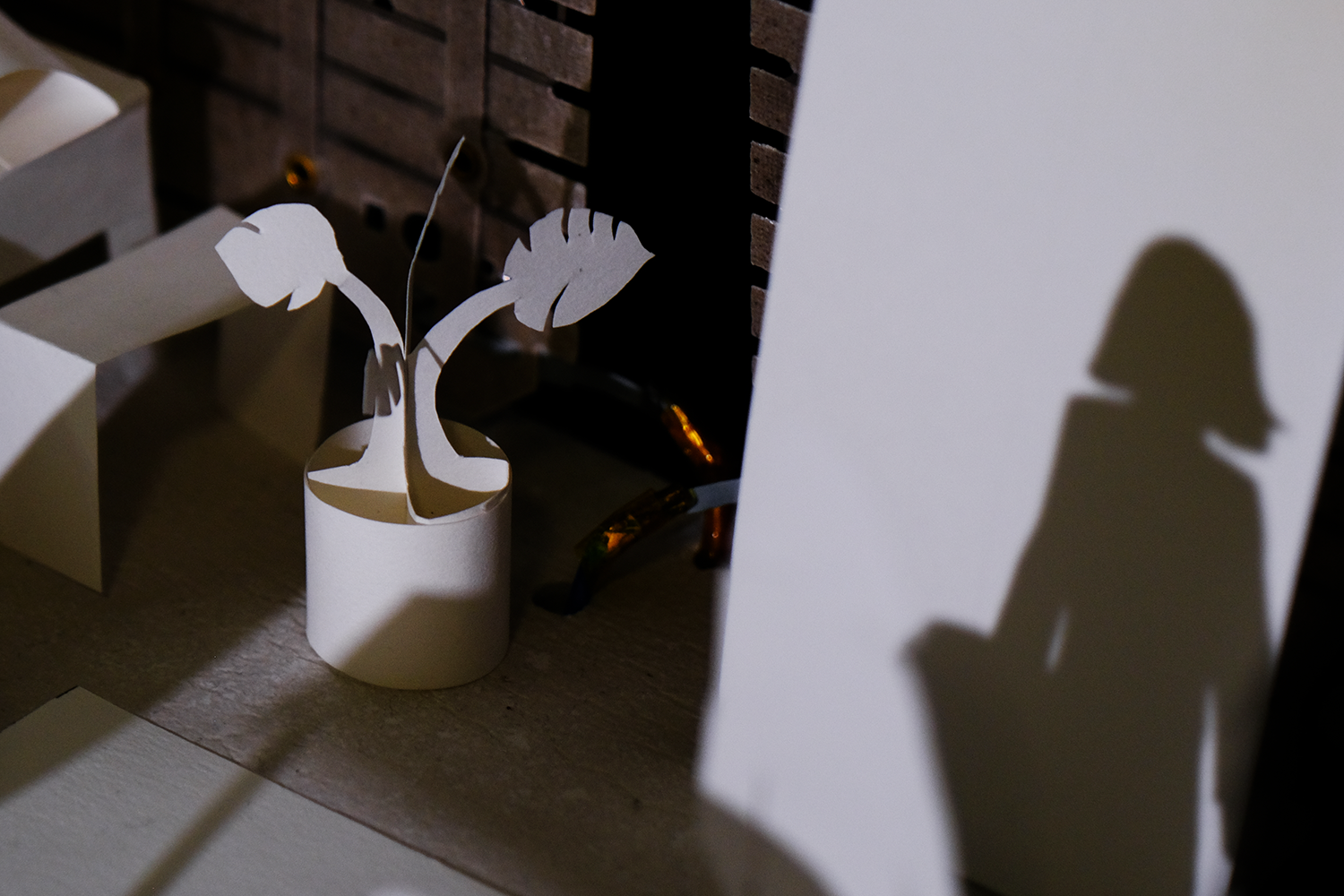
Apartment
At the center of Burning House is a miniature version of my own NYC apartment. The fragile paper apartment is intentionally modeled after a 'typical' NYC-apartment to make the project relatable to its target audience.
Even though we live in an area that is not disproportionately impacted by rising temperatures, I want every person to ask themselves 'What if it was my own home that was affected from temperature rise' when interacting with this project.
Even though we live in an area that is not disproportionately impacted by rising temperatures, I want every person to ask themselves 'What if it was my own home that was affected from temperature rise' when interacting with this project.
Process
Big Picture
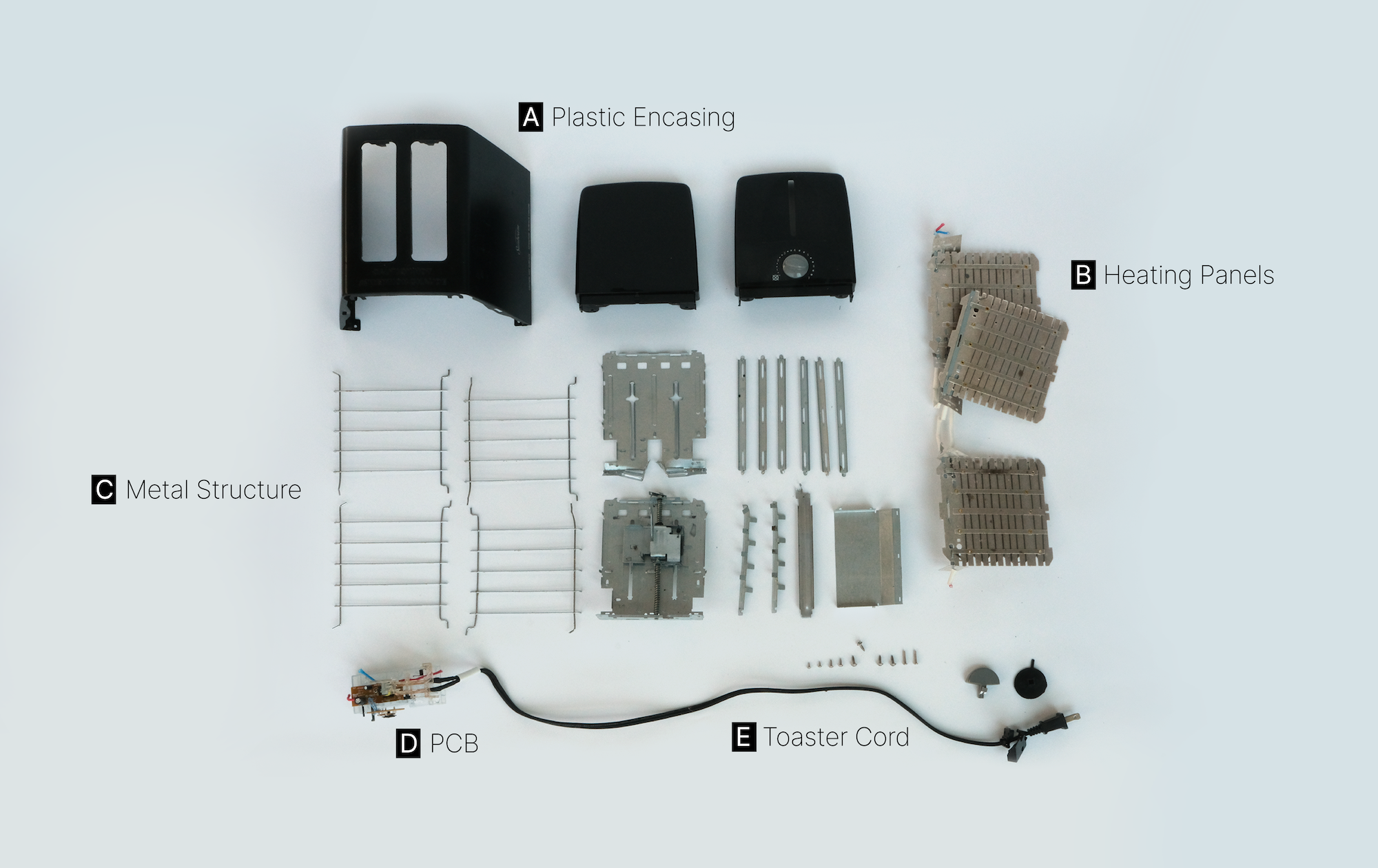
Burning House is made of a recycled toaster heating panels that are controlled by electronics and Arduino code. The paper apartment sits on a cement base that contains the electronics.
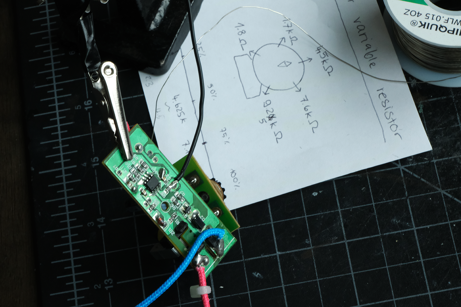
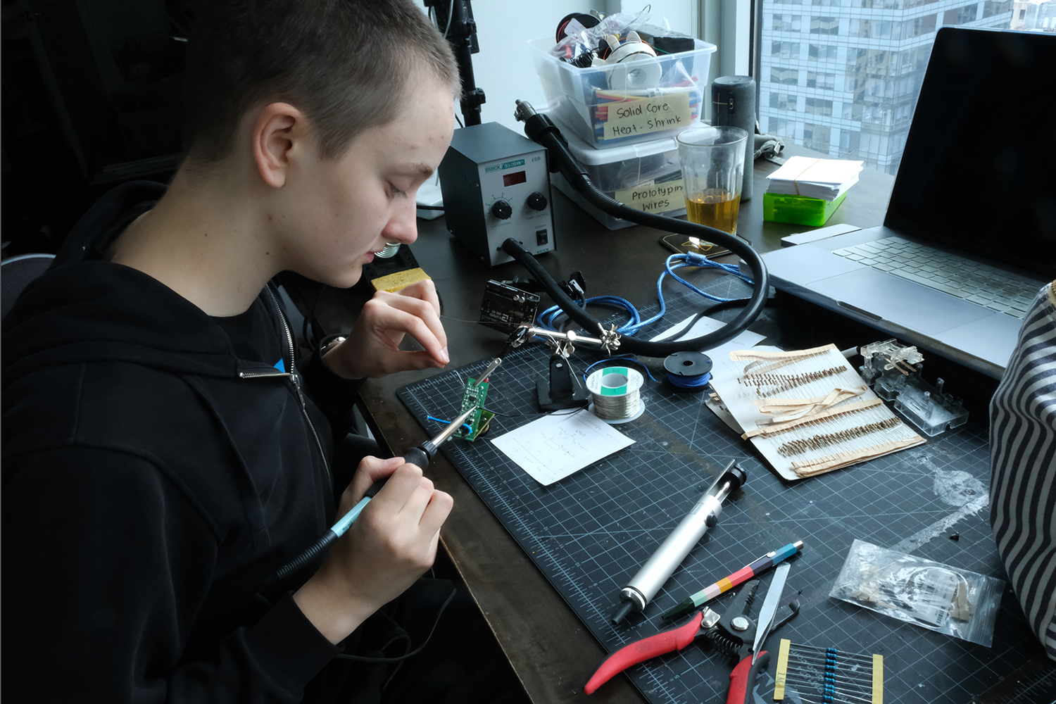
Gutting a toaster
The heating elements of a toaster were used for this project because they heat up quickly and are cheap. I took apart two toasters from Facebook Marketplace to learn how they are powered, and to recycle its electronic components for my own project.
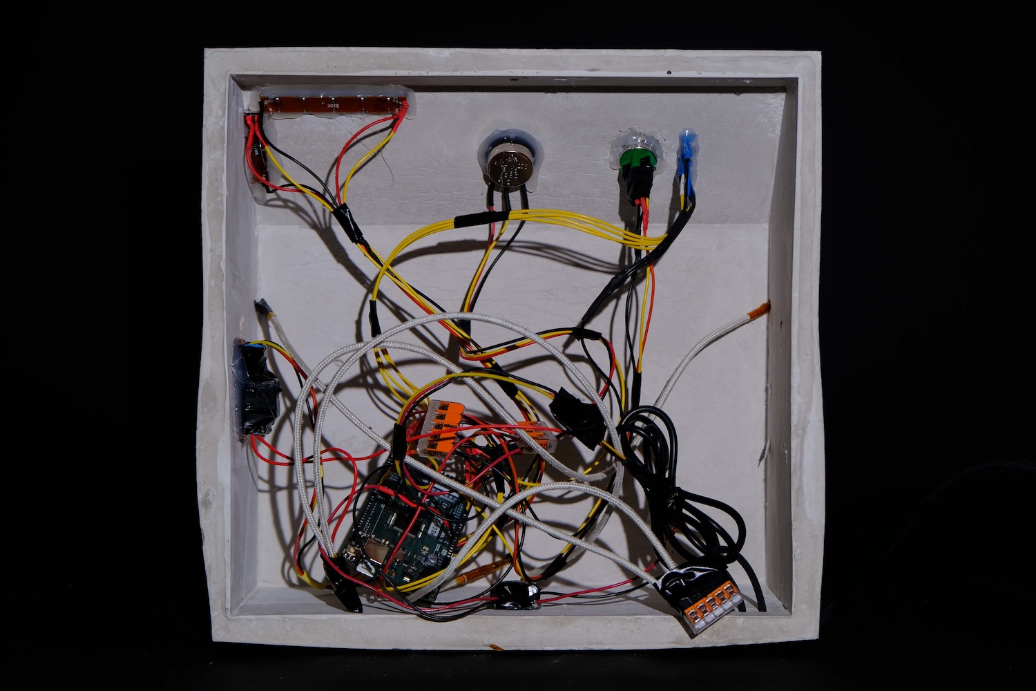
Electronics
One user-cycle works like this:
1. User presses the start-button.
2. Target temperature is calculated from users' input.
3. 120V are passed through the heating panels via a relay.
4. Temperature in apartment is continually measured via a temperature sensor.
5. When target temperature is reached, heating panels maintain temperature for 30 seconds.
6. Heating panels are turned off until temperature decreases back to room temperature.
7. Project restarts.
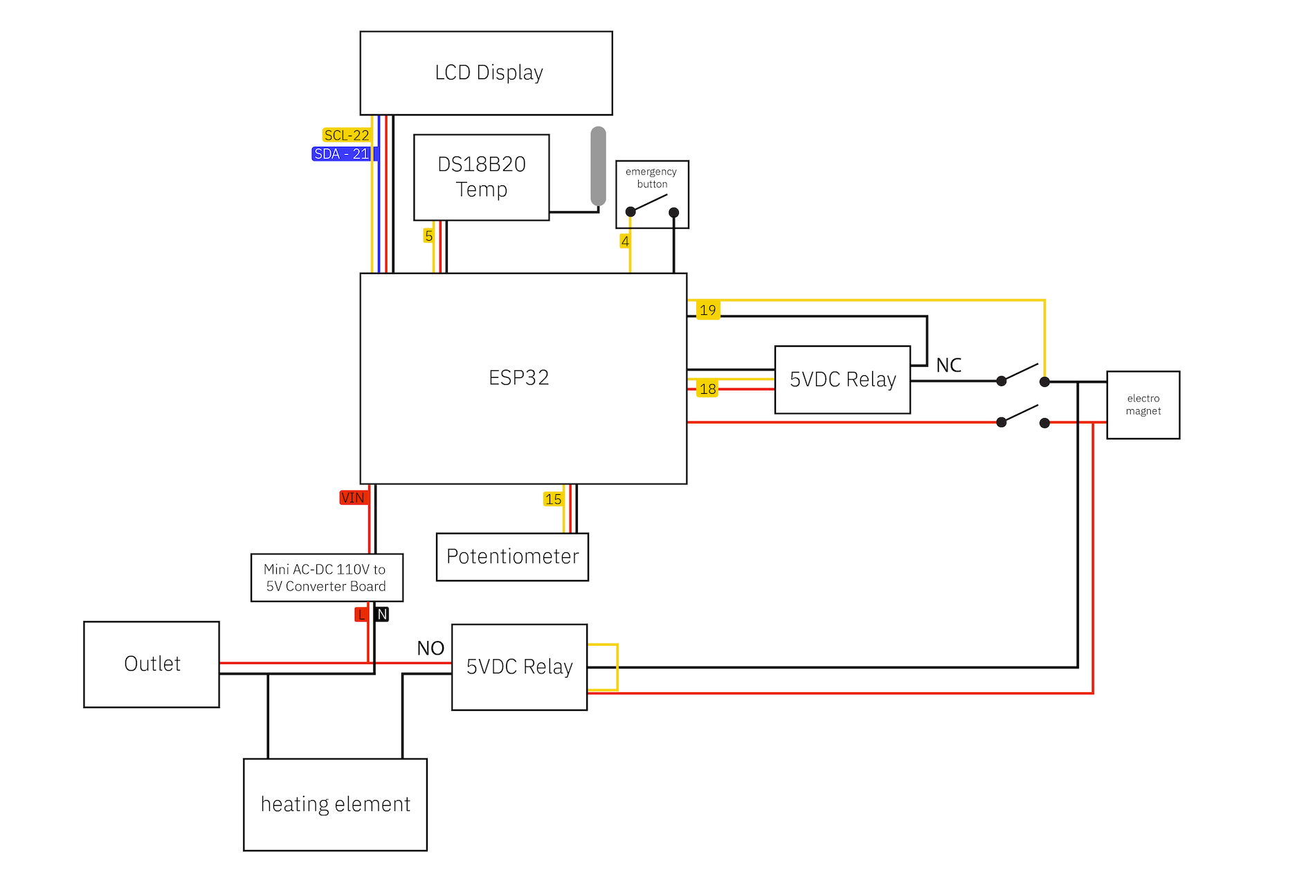
Wiring
Re-soldering and re-wiring the toaster's original PCB was the biggest challenge of this project. It took me a couple of attempts to figure out how a toaster even works, and how I can safely write my own code to turn on and off the heating panels.
Pouring Cement
The base of Burning House is made from cement because it is not conductive and heat-resilient.
... cutting a foam-core mold
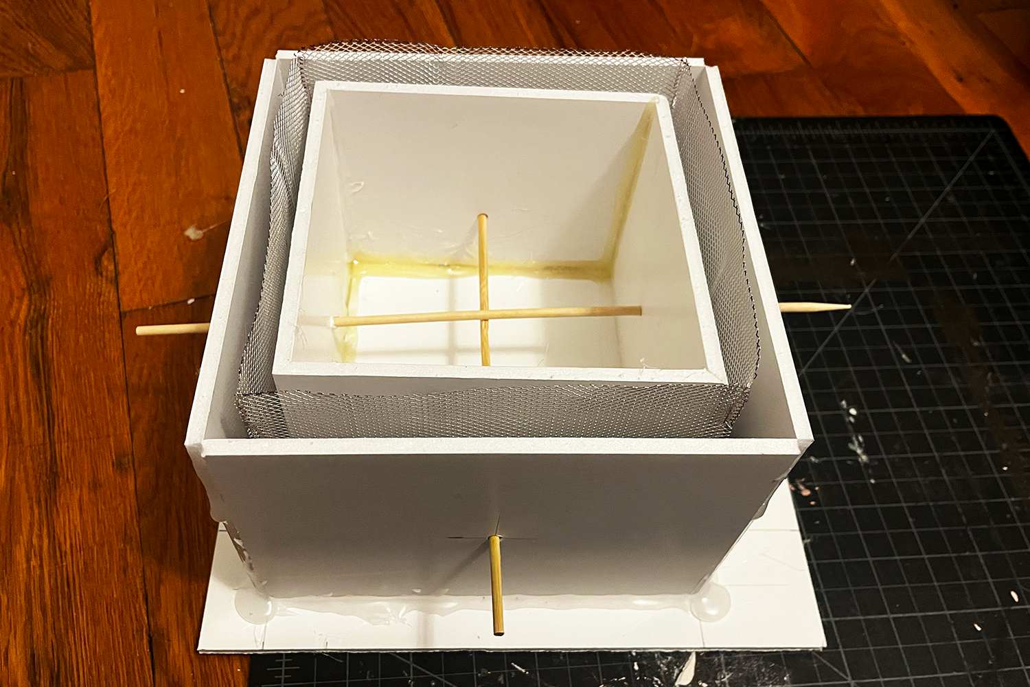
... the concrete wall is reinforced by wire mesh
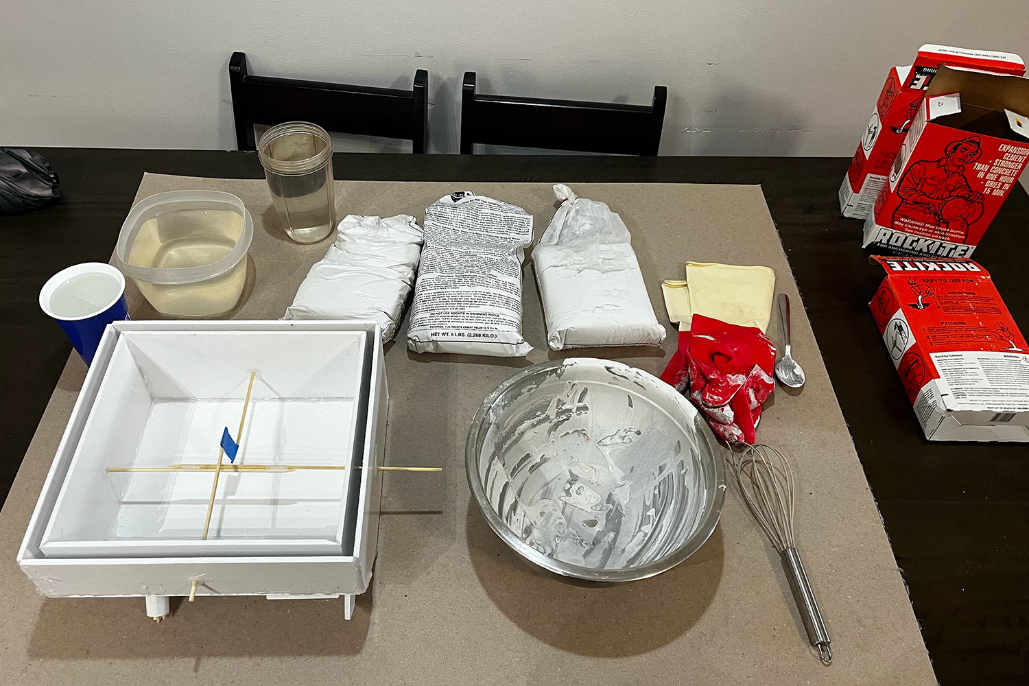
... mixing and pouring the cement into the mold
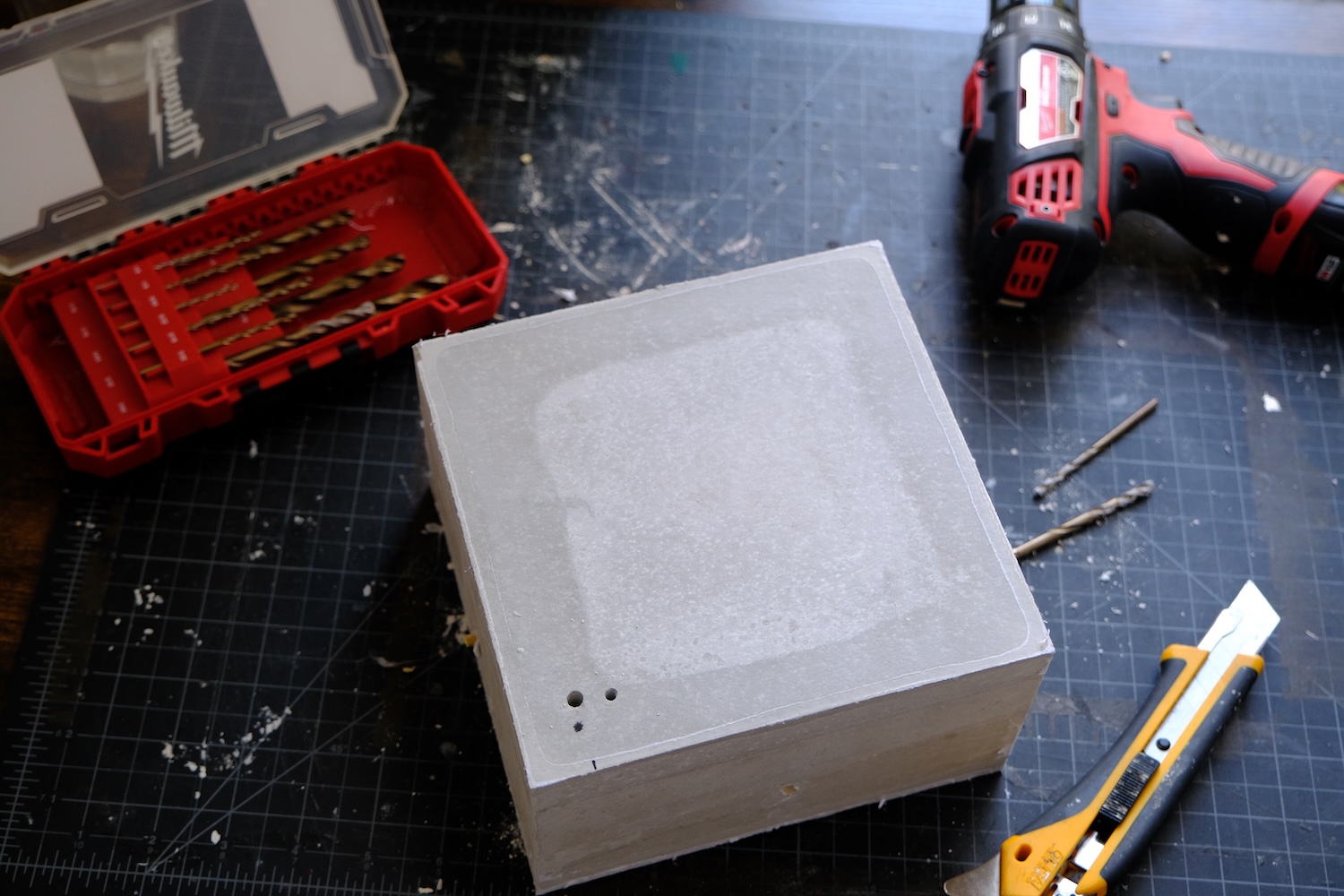
... drilling holes for wires into the cured cement block
Assembling
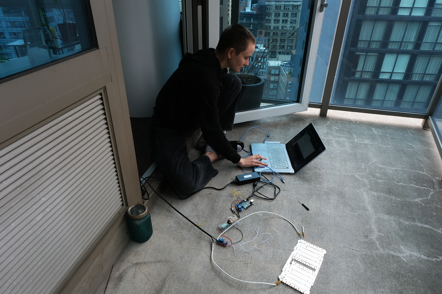
I tested the final electrical circuit on my balcony because I was scared it would explode (again). Thankfully it did not! I then attached the wires to the cement base with hot glue.
Special Thanks
I'm extremely grateful for The Puffin Foundation to have funded and supported me during the making of this project. This is my first grant-supported art project, and it has been an amazing learning opportunity to further my practice as an artist!